This article will look at how to parse OCA (Overlays Capture Architecture) from an Excel template and convert it into OCA Bundle, a zip archive file. We will also describe the files included in the zip archive and show how to read the meta.json file. Additionally, we will demonstrate how to verify the integrity of the OCA Bundle and validate the captured data. Finally, we will look at transforming the units of captured data from Celsius to Kelvin. By the end of this article, you will have a better understanding of the OCA system and how to work with OCA data.
Prerequisites
To follow described OCA exploration, you will need the OCA Bundle file. To get one, you can:
generate it from the XLS template. To do this, download the prepared oca_bundle.xlsx file with defined OCA for capturing data from a temperature sensor. Then, the OCA Parser is used to convert the XLS file into OCA Bundle as a zip archive. The command to do this is:
./parser parse oca -p ./oca_bundle.xlsx --zip
In either case, once you have obtained an OCA Bundle, you can begin exploring the structure and contents of the bundle and working with the data contained in it.
Under the hood
Let’s see what the generated zip archive contains:
unzip -l oca_bundle.zip
This will produce output similar to the following:
The zip archive contains several JSON-formatted files, including overlays and capture base files, that comprise the OCA Bundle. Furthermore, there is a meta.json file, a JSON-formatted file containing information about the other files in the zip archive. This file can be used to navigate through the OCA Bundle and access the overlays and other data collected in the archive.
The files attribute is a JSON object that maps the names of the overlays, bounded to capture base defined by a unique identifier (SAI) as key, and files to the SAI of the file within the OCA Bundle.
The root value references the top-level capture_base in the OCA Bundle. This capture_base is the starting point for traversing OCA when it contains attributes that refer to other OCAs, but it’s not covered in this article. If you are interested in investigating this topic further, you can read more about reference attribute type in the OCA documentation.
Verify OCA Bundle Integrity
The following code examples demonstrate how to verify the integrity of an OCA Bundle, a zip archive containing data captured by the Overlays Capture Architecture (OCA) system.
The code uses the resolveFromZip method to load the OCA Bundle from the file system. This function returns an OCA object representing the OCA data in the zip archive. Then creates a Validator object to perform the validation. The validate method of the Validator is then called on the OCA object to perform the validation.
In the JavaScript example, the validate method returns an object with a success property, which indicates whether the validation was successful, and an errors property, which is an array of error messages if the validation failed.
In the Rust example, the validate method returns a Result object, with Ok if the validation was successful, or Err with a vector of Error objects if the validation failed.
In both cases, the Validator object checks the OCA Bundle for any inconsistencies or errors, such as missing or invalid overlays, and returns information about any issues it finds. It allows users to ensure that the OCA Bundle is valid and can be used for accessing and analyzing the data.
Validating Captured Data
To validate the captured data, you need to use a tool like the OCA Data Validator. This tool allows you to check that the data in a CSV file conforms to the structure and format defined in an OCA Bundle.
To use the OCA Data Validator, you first need to download an example data file in CSV format. This file contains multiple rows of data, with each row representing a temperature measurement at a specific timestamp.
Once you have downloaded the data file, you can use the OCA Data Validator to check that the data in the file conforms to the OCA Bundle. To do this, you must create a Validator instance, set the validation constraints, and then run the validation process on the data.
Both the JavaScript and Rust examples below show how to do this. The code creates a Validator instance, sets the validation constraints, and checks that the data in the CSV file conforms to the OCA bundle. If any issues are found, an error will be returned.
In the JavaScript code, the oca-data-validator and oca.js-form-core packages are used to create a Validator instance and resolve the OCA Bundle. The csvtojson package is used to parse the CSV file into a JSON object, which is then passed to the validate method on the Validator instance to validate the data against the OCA Bundle.
In the Rust code, the oca_conductor and oca_zip_resolver crates are used to create a Validator instance and resolve the OCA Bundle. The std::fs module reads the CSV file’s contents into a String, which is then passed to the add_data_set method on the Validator instance. The validate method is called on the Validator instance to validate the data against the OCA Bundle.
Transforming Units: Converting from Celsius to Kelvin
Transforming units is a common task when working with data captured by sensors. In the case of temperature data, it may be necessary to convert from one unit of measurement to another. For example, you may need to convert from Celsius to Kelvin or vice versa.
The following code demonstrates how to use the OCA Data Transformer to convert the units of captured data from Celsius to Kelvin.
The code reads the data from a CSV file called data.csv using the fs module and stores the data in a variable called data. The code also sets a delimiter for the CSV data, specifying the character used to separate the values in each row. In this case, the delimiter is a comma.
The code then uses the resolveFromZip function from the oca.js-form-core package to read the OCA Bundle from the specified zip archive file.
Next, the code creates a new Transformer instance and adds the CSVDataSet instance that was created earlier to the transformer. The Transformer instance is then used to transform the data in the OCA Bundle. In this case, the transformation is specified using a Unit overlay that defines the attribute units to be used for the temperature data (in this case, Kelvin).
Finally, the code calls the getRawDatasets method on the Transformer instance to retrieve the transformed data. This method returns the transformed data as an array of datasets, which can be accessed and used as needed.
Conclusion and Next Steps
The OCA Bundle provides a number of benefits over more traditional methods of representing data. It enables the data from different sensors and devices to be easily combined and shared with other applications or systems, which can help to improve the interoperability and usefulness of the data. Additionally, the OCA Bundle provides a consistent and well-defined structure for representing sensor data, which can make it easier for developers to work with the data in their applications.
There are many ways to continue exploring OCA and working with OCA data. One possible next step is to look at the OCA specification in more detail and learn more about the different elements of OCA. Another potential direction is to experiment with different ways of accessing and working with OCA data, such as using the oca.js library, oca-rust crate or other tools and libraries that support OCA. Finally, you could explore the use of OCA in real-world applications, such as IoT systems or other scenarios where data is collected and shared. Regardless of which direction you choose to take, OCA provides a powerful and flexible framework for managing and working with data.
Appendix
OCA object (with Form and Credential overlays ignored):
Nowadays, with the growth of technology and its usage in society, more and more stuff can be done with a tap on the screen. Shopping, ordering food, even taking a loan, all this is possible without leaving the home. Moreover, it’s a technological goal to make everyday situations done within a short period of time when simply sitting on a couch. However, when for most of the people can more or less easily access such an app, it is important to make it reachable to the group of people with disabilities.
W3C guide
In its main document about mobile accessibility , W3C points out that mobile doesn’t only mean phones - other wearable and portable devices count here as well. But let us focus on the apps designed for what we always keep in our pockets. The organization has chosen four principles, that mobile applications designed to be approachable for the disabled should follow:
Perceivance - Becoming aware of users’ incapacities, this part of the documents speaks of the screen size, zoom and contrast
Operability - Making the app work similarly well to the non-accessible version, this principle speaks about moving around the app with multiple gestures and screen control.
Understandability - When making an app easier to access, it is also important to make it as easy to use, as possible. This section mentions the consistency of application layout.
Robustness - Preparing an app for all the “damage” that can be done with e.g. inputs, this area of the document acknowledges ways of entering the data to the application.
Let us focus on each principle and present recomendations suggested by W3C for designing an mobile app.
Perceivance
Small screen limits the amount of information that can be shown to the user. It is important to minimize it in comparison with the desktop version. Focus on the most important ones.
When the amount of information has to stay the same, provide different rendering to make it as readable and accessible, as possible.
Decrease the need for zooming in.
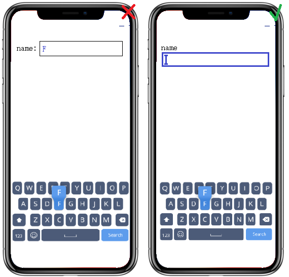
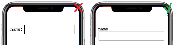
When it comes to data forms, position the form fields below their labels
User should be available to control app content size. OS-level features to handle it include setting defaut text size (in Display Settings), or magnifying entire screen/part of the screen under user’s fingers (available in Accessibility Settings)
Success Criterion 1.4.4 Resize Text (Level AA): Except for captions and images of text, text can be resized without assistive technology up to 200 percent without loss of content or functionality.
It should be kept in mind that mobile phones can be used in different outdoor conditions and the readability of screen content may vary.
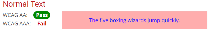
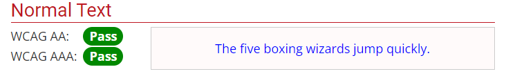
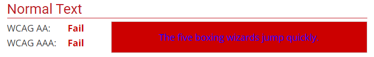
Success Criterion 1.4.3 Contrast (Minimum) (Level AA): The visual presentation of text and images of text has a contrast ratio of at least 4.5:1. In practice, it means that the difference in color between text and its background should be big enough for the text to be accessible for by people with moderately low vision (who do not use contrast-enhancing assistive technology).
Contrast of 1.45:1 :Contrast of 4.84:1 :
The advantage of mobile phones is that the keyboard, not being physical, is only visible when focused on some input. It is important to make it as accessible as possible, including a support for an external physical keyboard or alternative input ways.
People with visual disabilities can benefit from some characteristics of physical keyboards over touchscreen keyboards
People with physical disabilities, can benefit from keyboards optimized to minimize inadvertent presses
Some people can be confused by the dynamic nature of the digital keyboard and may prefer the physical one.
Success Criterion 2.1.1 Keyboard (Level A): All functionality of the content is operable through a keyboard interface without requiring specific timings for individual keystrokes, except where the underlying function requires input that depends on the path of the user’s movement and not just the endpoints. This means the keyboard interface is being used and the usage of alternate keyboard is possible. E.g. a blind person is not able to use the mouse input, or any other one that requires mouse-hand coordination.
Success Criterion 2.1.2 No Keyboard Trap (Level A): If keyboard focus can be moved to a component of the page using a keyboard interface, then focus can be moved away from that component using only a keyboard interface, and, if it requires more than unmodified arrow or tab keys or other standard exit methods, the user is advised of the method for moving focus away. E.g. user can move through the calendar tabbing through its content.
Success Criterion 2.4.3 Focus Order (Level A): If a Web page can be navigated sequentially and the navigation sequences affect meaning or operation, focusable components receive focus in an order that preserves meaning and operability. This means order of the sequential information should be consistent with with focus order.
Success Criterion 2.4.7 Focus Visible (Level AA): Any keyboard operable user interface has a mode of operation where the keyboard focus indicator is visible. The app developer should help the user know which element has the keyboard focus. ‘
Interactive elements on the screen should be big enough and spaced widely enough not to be tapped by accident when wanting to perform other action. Best practices recommend ensuring that touch targets are at least 9 mm high by 9 mm wide (which is around 48x48dp) and surrounded by a small amount of inactive space.
In the age of multiple screen gestures, it important to make them as simple as possible. For people with some disabilities who e.g. use a stylus, some gestures might be hard to perform. Another thing is that some instructions on how to use provided gestures can be useful.
Be careful of device manipulation gestures - when shaking or tilting the phone may not be a hard action to perform, it can be a challenge for users with disabilities.
Buttons should be easily accessible, e.g. with a move of thumb, no matter left or right hand.
Understandability
Some users have their devices fixed in a particular position, e.g. when mounted to a wheelchair. Developers should try to support both portrait and landscape orientation of an app. Moreover, changes in orientation should be signalled if the user is utilizing the screen reader.
Consistency of layout is essential. If an element is repeated throughout a screens, its position should be fixed and the same on all of them. Order of reappearing elements should also be equal.
Success Criterion 3.2.3 Consistent Navigation (Level AA): Navigational mechanisms that are repeated on multiple Web pages within a set of Web pages occur in the same relative order each time they are repeated, unless a change is initiated by the user. E.g. Iindividuals with low vision who use screen magnification to display a small portion of the screen at a time often use visual cues and page boundaries to quickly locate repeated content.
Success Criterion 3.2.4 Consistent Identification (Level AA): Components that have the same functionality within a set of Web pages are identified consistently. People who use screen readers use when operating a rely heavily on their familiarity with functions that may appear on different Web pages. If identical functions have different labels (or, more generally, a different accessible name) on different Web pages, the site will be considerably more difficult to use.
Most important piece of information should be visible without scrolling
Elements that perform the same actions should not be duplicated.
Success Criterion 2.4.4 Link Purpose (In Context) (Level A): The purpose of each link can be determined from the link text alone or from the link text together with its programmatically determined link context, except where the purpose of the link would be ambiguous to users in general.
Elements that trigger changes should be easily distinguishable from non-actionable elements. They should also be recognizable by screen readers. Examples of distinguishing features include providing a conventional shape, style or positioning, color offset and widely known iconography.
Success Criterion 3.3.5 Help (Level AAA): Context-sensitive help is available. Users with disabilities may be more likely to make mistakes than users without disabilities. Using context-sensitive help, users find out how to perform an operation without losing track of what they are doing.
Robustness
Setting the type of keyboard helps prevent errors and ensures formats are correct. However, it can be confusing for people who are using a screen reader when there are subtle changes in the keyboard.
The need for text entry should be reduced. Provide select menus, radio buttons, check boxes or by automatically entering known information (e.g. date, time, location).
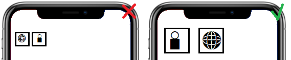
Support the platform characteristic features defined in accessibility settings.
Accessibility in practice
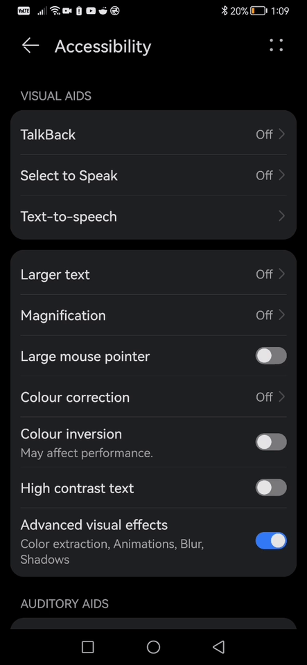
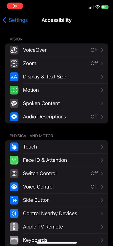
Accessibility settings - Main place for all accessibility features available on both Android and iOS. It allows for control of visual, auditory and motor aids on the device.
As it has been mentioned by W3C, the text size and contrast remain a very important criterium when developing an accessible app. From the accessibility settings, user can select larger text size, enhance the contrast or even choose a color-corrected display for partial color blindness. However, it only affects the visible colors, not the real colors and the change is not visible on a screenshot.
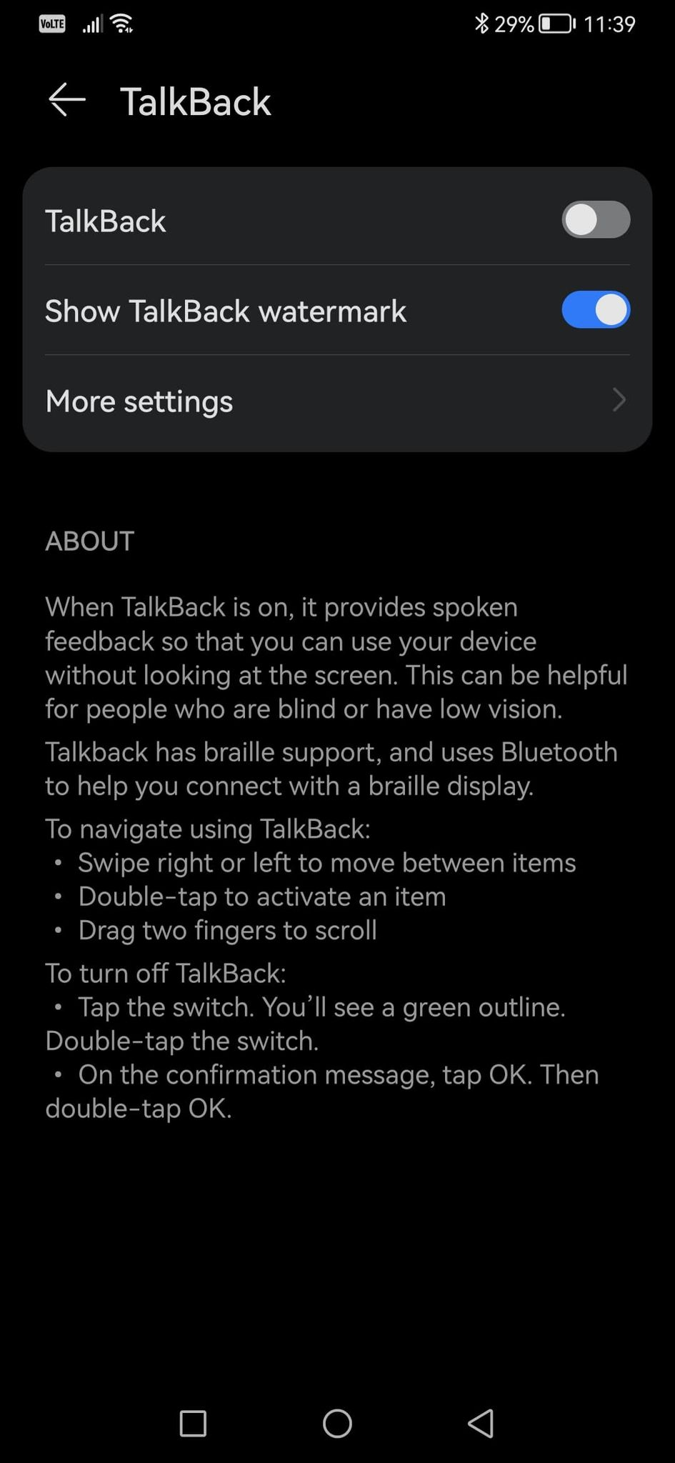
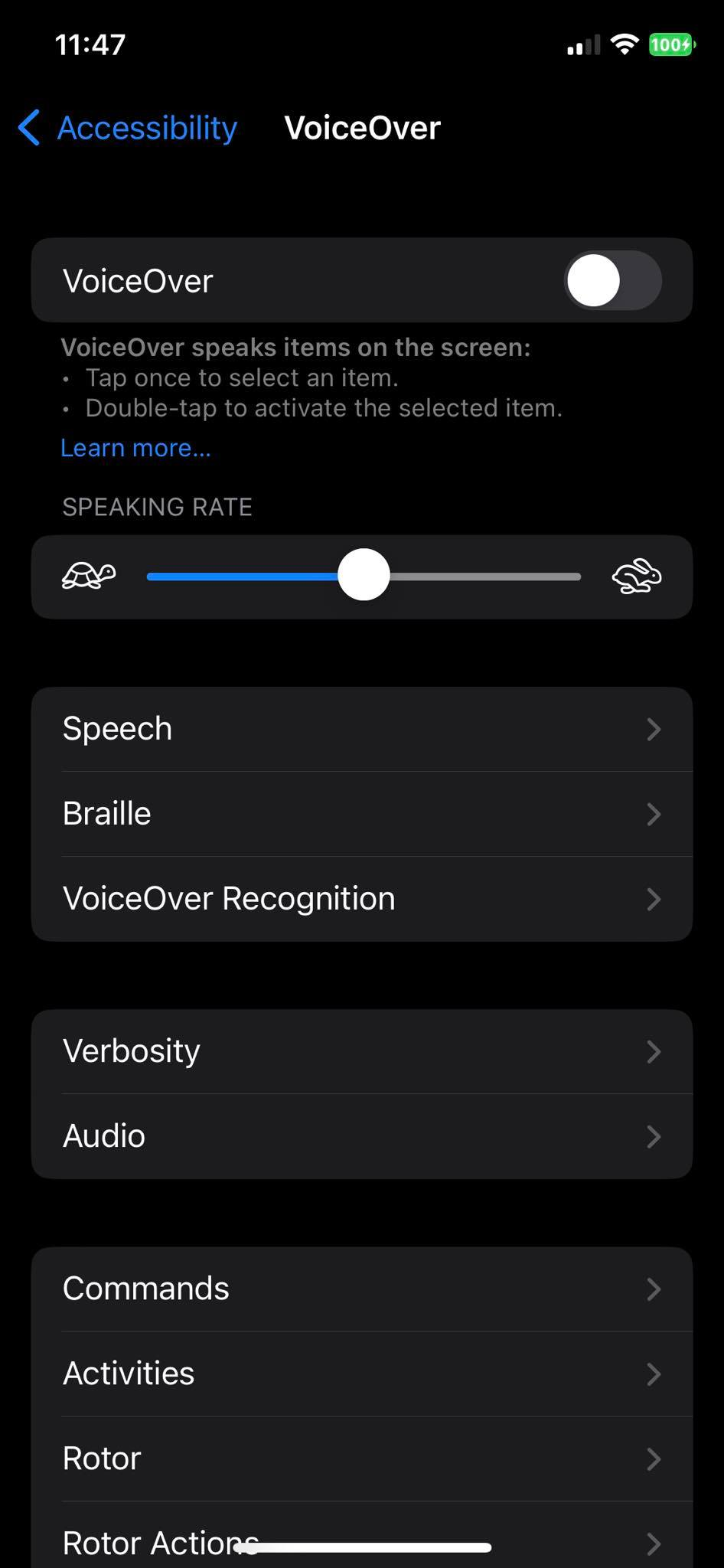
Screen reader - One of the most important features for people with impaired vision. It reads the content of the screen to the user and is available from the phone’s accessibility settings, no need for downloading an app. It goes under a name TalkBack on Android and VoiceOver on iOS.
TalkBack/VoiceOver proves the importance of good input fields labelling, decreasing the amount of information on one screen and intuitive layout. With such proper sign, the operation of screen reader is more simplified.
The screen reader settings also allow the user to configure a Braille keyboard. But what does it look like, if the widely known Braille focuses on touch? Well, the Braille keyboard on mobile takes entire screen and shows six dots which, with some help of the screen reader allow for the input.
Here is a video on how the TalkBack screen reader is used as well as the Braille input.
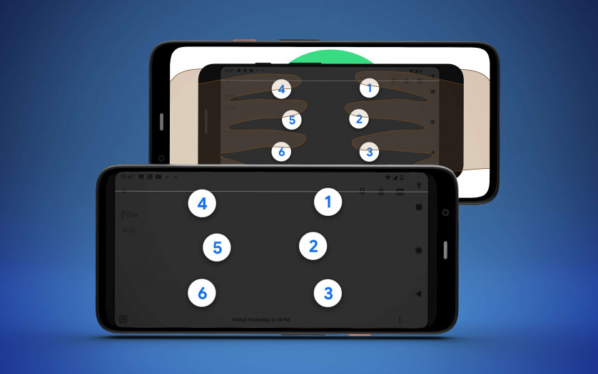
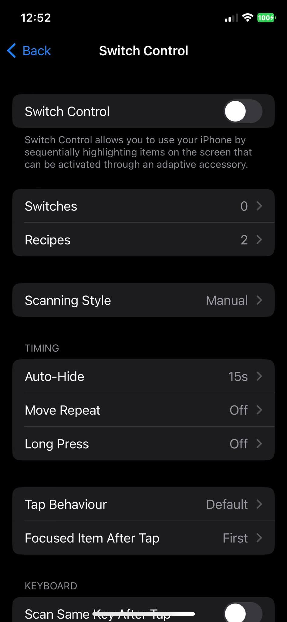
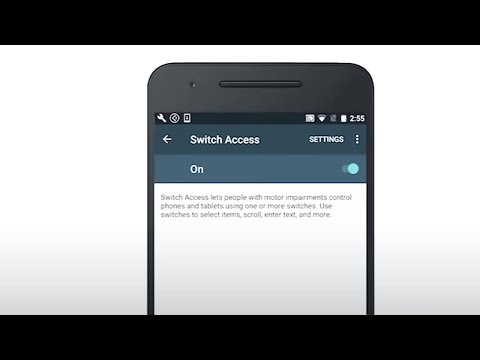
Switch access - It allows for the device to be controlled by a physical switch. Provides a way of input and phone handling for people with motion impairement. Available natively on both Android and iOS under the accessibility settings.
This feature exploits the understandability criterium, recommend by W3C. Switch access might be used by people with serious enough mobility issues to be put on a wheelchair, where the phone would be in a fixed position and orientation. Moreover, if the app layout repeats on a few screens, a person using a switch will be able to move around the app much faster.
Below is an official Google video showing a short explanation of switch access feature. For more tutorials visit Google support page.
Flutter and “encoded” accessibility
Another important concept is whether it is possible to somehow encode a desire for accessibility in an app. When the user interface of an app is divided into template and layout overlays, first of them containing widgets arrangement while the other one the widgets themselves with their args, the question is, is it achievable to impose on them both third, accessibility overlay? Let us present a few possible solutions considering flutter as a app programming language.
Acessibility overlay idea #1 - For some requirements it would be possible to inject them into the widget tree combining not two but THREE overlays. Considering using json_dynamic_widget as a widget tree builder and some own code for merging two JSONs into package-readable one, the third JSON aka accessibility overlay would have to be injected into layout overlay JSON. Let us consider some particular requirements:
Label positioning - This one is possible to impose, with some constraints. What is not known from the TextFormField widget and its arguments itself is whether the developer has put the field in a column/row with a text description, fake label. Below is an example of a JSON describing a text_form_field.
If a developer has put a hintText there, but no labelText, code that merges the overlays could put hintText value for a labelText. Not a perfect solution, since label should be a definite word describing input, while hint should be providing an example for an input, but when a hintText says Your name, e.g. John, such label text would be enough to understand. If a developer has put a fake label above a TextFormField, that would be more difficult, but the merger could check for a widget “next to” the TextFormField. ONLY if they remain in the same row/column. But what if they do not?
keyboard type - robustness criterium to provide e.g. numeric keyboard when a PIN input is wanted. Again, having in mind a Flutter TextFormField widget, it can define a keyboard type using keyboardType attribute:
Easy to inject as well. Merging code could easily impose a keyboardType arg if it has not been provided. BUT what kind of keyboard type? Accessibility recommendation is that a specific input is provided for some fields like phone number. No doubts about that, for people using switch access it would be much faster to switch through 9 numbers that wait for the right number on the qwerty keyboard to show. The proposal is to provide it. However, the input type depends on the form data themselves. It is not possible to do something like this for accessibility overlay:
This way, what can be achieved is a necessity to provide a keyboard type. But the type itself would have to be read e.g. from a label - if it says ‘phone’, go for "keyboardType" : "phone". ‘email address’? "keyboardType" : "emailAddress". But what if the label says something completely different, like PESEL evidential number? Merging code would have to be programmed to read this as a numeric input. Moreover, it is not possible to just copy the label as a keyboard type. Email being a great example for this one.
Link purpose - Is it even possible to define this one? The AAA criterium says that every link text should define link purpose. Considering such a situation - the developer is making an app about birds. Each screen is a name, photo and short description of a bird. App is accessible, contrast is 8.5:1, font is large. At the bottom of each screen there is a smaller Source of information text, which serves as a link to a Wikipedia page about each bird. And this is perfectly fine, screen reader would read this as “Source of information. Double tap to activate” or something similar, the user would know how to follow it. But is it achievable to enforce a understandable link text? Let us start with the fact that it is UNKNOWN whether a text is a link - Flutter has no link widget, and a simple way to provide a link text would look like this (url_launcher package required):
It is not desirable to impose something on each InkWell widget as none of them have to be links. But hypothetically, considering there exists a link widget, how can it be forced to say “Source of information” instead of e.g. “x”? Only when it is known that the screen is responsible of information about birds and if a link occurs, it is a source of information on Wikipedia. Such hypothetical accessibility overlay could look like this:
1
2
3
4
5
6
7
8
"accessibility":[{"type":"link_widget","args":{"text":"Source of information"}}]
Focus visible - a criterium that actually could be imposed by an accessibility layout. Not in the best possible way, hovever. This one mentions that a focused field (let us talk about a TextFormField again…) should be easily distinguished from a non-focused one. Luckily, TextFormField’s InputDecoration has a field called focusedBorder, which defines a border, that is shown when the field is focused. Accessiblity overlay could force that a border width, when the field is not fucused would be 1 and when focused, 3. It would enable the user to distinguish between the states of the text field:
This way color of none of the borders would be defined, but the difference between focused and unfocused state would be imposed.
Interactive elements size - Luckily, when it comes to buttons (but buttons only!) Flutter provides a way to define their size. Each of the button classes (ElevatedButton, OutlinedButton, TextButton) has an attribute called minimumSize:
However it is crucial to keep in mind that buttons are not the only elements that are interactive.
Accessibility overlay would for sure be a step forward, but there are situations where automatic imposing of some accessibility recommendations would not be possible and human verification would be crucial.
Overlay parser - Not a overlay itself, this last chance solution would be checking whether the designed layout meets accessibility requirements, not imposing them. This should be treated as a “fun fact” and a workaround, not a definite solution.
Color contrast - What is necessary to find the contrast between two colored items is the tint of both child and parent widget, for entire widget. While not impossible, it would impose a requirement of iterating through all widgets and developing some contrast checking code.
1
2
3
4
5
6
7
8
9
10
for(widgetinwidgetTree){varcontrast=checkContrast(widget.parent,widget)if(contrast>7:1){//App very accessible}elseif(contrast>4.5:1){//App accessible}else{//App not accessible}}
Label positioning - Label of a TextFormField should be positioned above the field, not next to it. Actually, there is no need of an artificial label at all. TextFormField has a field called decoration which can contain the label itself:
1
2
3
4
5
6
7
TextFormField(decoration:constInputDecoration(icon:Icon(Icons.person),hintText:'What do people call you?',labelText:'Name',),)
So it would be necessary to just check whether all the widget tree elements that are of type TextFormField contain labelText.
And the list can go on and on. Let us stop with these 2 examples as this idea is just a workaround, not a real solution.
Accessibility overlay proposal
Summing up the points about encoded accessibility and W3C guide, the JSON shown in this part of the article could serve as an accessibility overlay. It is important to keep in mind that many of the requirements proposed by W3C cannot be machine-imposed. A lot of them require some context to be understood, like link text or keyboard type.
Accessibility overlay could serve an important purpose for both disabled people and app developers. Without further research, app creators would be able to adjust their content to some special needs. No matter how easy this sounds, the real task is actually much more difficult. First of all, the list created by W3C is just a requirement guide. Actual people with disabilities may have other, individual wishes, that are not on the list. Such briefs or proposed here solutions are made by people who do not use them. It would be advised to consult accessibility solutions with people who would be their users, who need the app adjusted to their needs. Moreover, as stated before, some of the solutions for accessibility overlay require context of the field. Keyboard type or link text has to be imposed basing on their surroundings, which may be hard or even impossible to get by a machine. Another important thing is the operating system of a device. Actually it is absolutely stunning that both mobile ecosystems have so many native solutions for accessibility, that allow numerous disabled people to use their products with greater comfort (or even be able to use them at all). However, for desktops, the accessibility features may look completely different. Overlays should be able to distinct between mobile and stationary device, which requires at least two accessibility overlays for one app. To sum up, it would be both beneficial and really hard to create a solution that would successfully impose amenities for the disabled on the app creation.
Both, Flutter and Rust are pretty novel technologies in the industry. Both also introduce a paradigm shift of how to approach portability, a very old and diffcult problem to solve. Portability is diffcult due to lack of common denominator across platforms, devices and operating systems. To achieve it, Flutter comes with a concept of MethodChannel, a cross-boundary interface that allows to write and call platform native code. It then enables seamless integrations that are essential when working with Operating System specific user interface or natively accessing device peripherals. No more tweaks thanks to proper integration mechanisms. Rust, on the the other hand, is getting traction in various ecosystems and there are at least several reasons why it becomes more and more popular as general purpose programming language. Rust is in essence a C-based language with novel concepts and modern tooling supporting the language. It has steep learning curve due to the architectural decisions baked in into the language. However once it is overcame it pays off. One especially interesing characteristic of the language is its adaptability in almost any environment. As a C-based language, program written in Rust can be exposed as a binary to many modern Operating Systems. Not only that, thanks to Foreign Function Interface (FFI) integration possibilities of Rust-based code, it became viable alternative to write platform agnostic code and expose it through FFI. In other words one Rust library can be consumed by any other C-based language. The core business logic is then encapsulated into one library that is later consumed within platform specific languages.
This post guides the reader how to benefit from Flutter and Rust collaboration in a best form. When native programming lanugages available in FlutterMethodChannel don’t come in handy, flutter_rust_bridge might be the solution. It allows the use of Rust code in Flutter application through an externally generated library. This tutorial however will not be introducing to the usage of the plugin. It assumes the user is familiar with flutter_rust_bridgedocumentation and knows the basics. Moreover, to build for iOS and MacOS it is necessary to have access to Xcode and MacOS device. To build for Windows, Windows OS is needed as well. flutter_rust_bridge provided tutorial for Android + Rust plugin so it will not be covered here.
In the root folder of your project create a new directory. It will be later referred here as $rust_part.
Run cargo init inside $rust_part. This will create src folder and Cargo.toml file.
In the src folder there is one file: main.rs. It can be deleted. Create 2 new files called lib.rs and api.rs. The first one will call all modules from rust project while the other is a module containing all functions that should be bridged to dart.
Modify the api.rs file and add your library functionality. In this case it will be a simple hello world string function:
Cross compiling targets setup will not be covered here. For more information on the topic please check the recommended flutter_rust_bridge documentation (here is an example of Android target setup).
The Rust part is ready to be built. For different targets use:
For Android: cargo ndk -o ../android/src/main/jniLibs build --release. This command results in two librust_part.so files for two Android architectures.
For Windows: cargo build --release (has to be executed on Windows OS) . Important: The crate-type in Cargo.toml has to be changed to "dylib". In folder rust_part/target/release you will find files called rust_part.dll and rust_part.dll.lib. Remove the .dll part from the second one and the Windows files are ready.
For iOS: cargo lipo. In folder rust_part/target/universal/release you will find librust_part.a file.
For MacOS: cargo build --release (has to be executed on Windows OS) . Important: The crate-type in Cargo.toml has to be changed to "dylib". In folder rust_part/target/release you will find file called librust_part.dylib.
iOS
Make sure you created support for iOS in your project with flutter create --platform=ios .Warning: This command will create all files that are automatically created when making new Flutter project. If for some reason you deleted some of them, you might need to get rid of them again.
Run cargo xcode in $rust_part. This will create a .xcodeproj file. This file will be soon opened in Xcode to change symbol stripping method.
Run cargo lipo in $rust_part. To specify target, run with -p $target flag. To build a release library (smaller in size), use --release flag.
Next, run the generator: flutter_rust_bridge_codegen --rust-input $rust_part/src/api.rs --dart-output lib/bridge_generated.dart --c-output ios/bridge_generated.h
Actually, the location of bridge_generated.h is not that important, as it is created only to have its content appended to another file.
Then create a symbolic link in iOS folder to .a library: ln -s ../$rust_part/target/universal/release/librust_part.a
You may also move the .a file to the ios folder, this way there is no need for the symlink as the library is directly accessible.
Then append the contents of bridge_generated.h to /ios/Classes/$Plugin.h: cat ios/bridge_generated.h >> ios/Classes/$Plugin.h
Then add in ios/Classes/.swift file dummy method:
1
2
3
4
publicfuncdummyMethodToEnforceBundling(){// This will never be executeddummy_method_to_enforce_bundling();}
Next, edit podspec file and add the following lines:
Next, remember to set the strip style to non global symbols on both the .xcodeproj in $rust_part and .xcodeworkspace in example (if you want to run the example).
Remember to edit pubspec.yaml file so it has following structure:
The pluginClass here for iOS stands for .h file in Classes folder.
iOS Troubleshooting
run pod install in ios folder with Runner (helps with module not found error in Xcode)
to run a different dart file than main.dart edit FLUTTER_TARGET in Xcode in Runner Build Settings.
check iOS Deployment Target, 9.0 might be too old for some releases.
MacOS
This tutorial is made for a multiplatform project and it assumes the iOS support is already working.
Add support for MacOS in your project by executing flutter create --platform=macos .Warning: This command will create all files that are automatically created when making new Flutter project. If for some reason you deleted some of them, you might need to get rid of them again.
To link your Rust library with MacOS, .dylib file type is necessary. To generate it, edit Cargo.toml, so that it has following structure:
1
2
[lib]crate-type=["dylib"]
Then run cargo build in your $crate directory. Remember to use the flag --release to make the lib much smaller.
Move your .dylib file to macos folder in your project.
In .swift file in macos/Classes add the dummy method (more about it in flutter_rust_bridge documentation):
1
2
3
4
publicfuncdummyMethodToEnforceBundling(){// This will never be executeddummy_method_to_enforce_bundling()}
Don’t forget to edit pubspec.yaml and add the MacOS support:
Copy the bridge_generated.h file from ios folder to macos/Classes. This file has been generated when enabling support for iOS. To generate it, run: flutter_rust_bridge_codegen --rust-input $rust_part/src/api.rs --dart-output lib/bridge_generated.dart --c-output macos/Classes/bridge_generated.h
MacOS Troubleshooting
If you run into no such module error while running the example, enter example/macos folder in project and execute pod install in the command line. This installs the missing module.
If during testing the example you run into cannot find 'dummy_method_to_enforce_bundling' in scope, run pod update.
For other errors, try pod deintegrate and pod install to reinstall pods.
Try deleting all folders from /Users/<your username>/Library/Developer/Xcode/DerivedData and cleaning your build folder.
Windows
This part of the tutorial assumes the user has generated library files .dll and .lib as described in Initial steps.
If your plugin project does not have Windows support activated, execute flutter create --platform=windows in project root folder:
Warning: This command will create all files that are automatically created when making new Flutter project. If for some reason you deleted some of them, you might need to get rid of them again.
Make a new folder under created in previous point windows directory, let us refer to it by $crate.
Place the .dll and .lib files in $crate directory and change their names to $crate.dll and $crate.lib.
In your $crate directory create a new file, CMakeLists.txt. Append the following lines to the file:
Edit the windows/CMakeLists.txt file. Add the following lines:
1
 include(../cmake/main.cmake)
Put this line after target_link_libraries line.
1
2
3
4
5
6
7
# List of absolute paths to libraries that should be bundled with the plugin.
# This list could contain prebuilt libraries, or libraries created by an
# external build triggered from this build file.
 set(flutter_rust_plugin_bundled_libraries
   "$<TARGET_FILE:${CRATE_NAME}>"
   PARENT_SCOPE
 )
Here, change "" to "$<TARGET_FILE:${CRATE_NAME}>".
Don’t forget to declare support for windows in pubspec.yaml file:
Where bridge_generated.dart is a file generated using flutter_rust_bridge_codegen and flutter_rust_plugin.dart is the main plugin file. For more information on flutter plugin check out the official documentation.
flutter_rust_plugin.dart file contains all methods that will be available in the plugin for the users. The libraries is loaded there. Here is an example of code used to load the libraries:
1
2
3
4
5
6
7
8
  static const base = 'rust_part';
  static final path = Platform.isWindows? '$base.dll' : 'lib$base.so';
  static late final dylib = Platform.isIOS
        ? DynamicLibrary.process()
        : Platform.isMacOS
        ? DynamicLibrary.executable()
        : DynamicLibrary.open(path);
    static late final api = RustPartImpl(dylib);
The RustPartImpl is the name of the class in bridge_generated.dart, the one class that extends FlutterRustBridgeBase. In order to call the method from library, use:
await api.methodName();
References
iOS: This tutorial was created using the official documentation of flutter_rust_bridge and mozilla github post. If something is not clear, checking out these sources might help you.
Windows: This tutorial was created using the official documentation of flutter_rust_bridge and this proof of concept for Flutter+Rust plugin. If something is not clear, checking out these sources might help you.
Since decades, especially the cinema industry tries to explore the concept of human being and machine seamless interaction. HAL 9000, J.A.R.V.I.S., to just name a few, they emerged to support human decision processes or simply to help execute them. Both of these AI’s used speech recognition and voice talk to communicate with humans. This is however not the only way to make the seamless interaction with a machine, but the only one that can be seen or heard (so the viewer can feel it using his senses) and at the same time that does not need any other peripheral device like keyboard or mouse. Not only that, it relies on the same sense as in human to human communication. From another angle, the most effective way for communication would be to make interactions by exchanging the “thoughts” straight from the human brain. It would be the fastest, sense-less approach.
While the cinema industry is usually ahead with their ideas in comparison to the tech possibilities at a given time, ocasionally some become the reality. In the recent years a concept of a chatbot has been employed at scale by various industries. Chatbot is a trained algorithm, to support human decision processes and interacts via text or voice. Both can be translated into computer command and the result of executing it translated backwards into human language, either displayed or said. While this way of interacting with machine has still its drawbacks, it is much more pleasant and way more faster.
Express the intention
To be properly understood by the other side while communicating, it is all about expressing intention by making clear statements. Humans tend to use contexts in discussions and are capable to grasp them, as opposed to machines. If the intention expression is however context-less, it is likely the machine will do what was intended by human. Being context-less is not a trivial task for humans, especially when context is present in almost any human to human interaction. It becomes an unnoticeable habit and yet, conversation parties understand each other. Humans have, however, yet another capability: they can adapt to the evironment boundaries, they can learn. Thus, while living in a context-rich environment, they have learned that digital space is different, more context-less oriented, especially while interacting with a machine and looking for an information. Search for information system capability is an excellent example. The more unambigious the intention expression is, the better quality the search results are. The search capability is fundamental as it may express various intentions. It can navigate through the information, distill the subset of an information or discover the unknown parts of the information. Therefore proper searching inherently becomes essential skill.
A counter-example to the search capability of a system is the user interface (UI). UI’s emerged to organize the information in a pleasant way, so to help humans navigate through the diss-information. Categorize it, distill and order according to the needs and personal preferences. Make it easily accessible. Where amount of the information increases, however, the organization and navigation enters the complexity. The more information to maintain, the more burden to cope with. Apart from that, organization is usually a personal, so customizable property.
While UI’s are the gateways to information management, they are opaque to what they are applied to. So whether this is an operating system (OS) UI, or just an extension to the OS, so the application, they tend to simplify management of the information. Important characteristics of the app is that it expresses an intention by providing service(s). Service can be anything that has the outcome of enriching the human needs, ie. buy a ticket.
UI’s are the answer to weak system search capabilities problem. Systems with strong search capabilities may reduce the need for fat UI’s. Fat UI represents a state where the information management has been done in contradiction to the human needs. An overloaded/overbloated UI not only does not serve its purpose, but also reduces the pleasure of making any interaction with it.
Expressing the intention involves human senses. Employing the senses create interactions through the underlying technology that is the gateway to digital world. This technology initially was able to provide “interface” solely for touch sense. Touch sense is however the least efficient, because it is time consuming activity to express the intention through employing it. It is now the time as it is evolving at scale towards more efficient senses like speech. Typing a sentence on a keyboard utilizing touch sense is three times slower than expressing it through human language along with speech recognition. It is likely the gap between these two will increase over time as the technology behind it becomes more mature. This is not the only gain, because if the touch sense is not involved, it can be occupied by another activities.
The overwhelmed amount of surrounding information
Individuals on a daily basis interact with various type of services and the outcome of such interactions is usually more information to be managed. Whether this is aforementioned buying a ticket operation, pumping a car on a gas station, or even issuing an agreement with new trade partner, it all produces new information. If furthermore this done in a digital world, the outcome is not written on a piece of paper that can be stored in a desired place, at least initially. The digital world, however, offers similar mechanims to maintain the information. Operating systems and applications managed through UI’s have coined solutions that tend to mimic the real world. Files, an analogy to a piece of paper. Directory, an analogy to a catalog. It all helps in information organization and categorization. When done, it reduces the amount of time to actually search the information, to some extent. It is however always limited to the categorization problem. In other words to get the information that crosses the boundaries, or crosses multiple categories, much more steps need to be done to actually get the meaningful result. So to enter each category, check if it is there, go to next one and repeat. A time consuming process. Note there might be many categories and these are usually personal, so in other words what worked for one person, might not work the same way for another person. With the increasing amount of information and categories it invevitably ends up in diffculties while searching, because more and more activities need to be done.
Consider such example:
A car owner wants to sell it. The buyer, so the new owner will demand a history of the car, including proof-of-provenance, insurance, all receipts from repairs, replacements etc. Although all this information is related to a car, it is not in primary relationship to a car. Insurance is a consequence of interacting with insurance company, receipts of repairs a result of interacting with car mechanic and so on. In many cases all this information has been delivered to the car owner via plain old email… While email box nicely aggregates information and provides search features, it is unfortunately context-less searching. In other words to find all the car related documents, car owner needs to provide some context, ie. mechanic name or his email, name of the insurance company or its email. Not only that, the current car owner needs to remember any type of document that is related to a car!
Consider another example:
Any company has to run bookkeeping, so every time period, ie. a month or quarter, a summary needs to be made and a tax paid. A summary, so a revenue (issued invoices) minus the operational costs that gives the income, a foundation to calculate the tax. Both, the revenue and operational costs are the consequence of company interactions with clients and suppliers. Interactions happen in many contexts and through various relationships. When the time comes, all the documents for tax calculation need to be collected. Sounds familiar? A very similar case to the previous example.
While information categorization can be applied in various contexts, it will be always personal. A person in digital space can use email labels or tags, directory structure on hard(pen) drive, or have no organization at all. Note all these activities lead to UI’s and managing information through UI’s. As discussed above, UI’s serve their purpose for information management until they don’t. The following chart shows the relationship between amount of information to be managed and UI capabilities to handle it.
In other words in a contextual, cross category information searches, no UI will play well, as UI is limited by its primary strength – the information categorization behavior. The more information to be managed, the less effective UI becomes.
“app-ism” – current approach to information management
Any operating system (OS) relies on extensions, the applications (apps) that enrich the OS capabilities. Through them users can express their intent. By adding more capabilities, more information need to be managed or remembered. Cross category information searches are not possible, because apps do not expose proper interfaces for such activities. In fact, even if they would, the quality of such cross-boundary searches will lack the information contextuality. This is again the weak system search capabilities problem.
Summary
User interfaces are powerful and flexible creatures that exist to make the human interactions with machines pleasant. This is however not always the most effective approach, especially in the information management problem that includes the search capability. User interfaces, by their nature will lack in complex, cross-boundary searches due to either missing information or context-less information.
Systems that are capable to interact with humans by leveraging more human senses will have the prevalence over systems that rely on classic user interfaces – that involve only touch sense. At the same time, involving more senses will reduce the complexity of user interface. A well-searchable system that has strong search capabilities, along with speech recognition would certainly redefine the attitude to the need of user interface as it is framed today.
A program without interface is just machine code. Machines understand everything tailored to language rules. They don’t care about interfaces, but humans do. Interfaces are for humans.
Interfaces are read many times more than are written. The weaker an interface is, the more diffcult it is to understand its intention. Respect other humans.
Various tools, patterns and techniques may be utilised to create interface, but only human can blend it together with appropriate proportions. That is a good interface.
Interface designer doesn’t start on 09:00 am and stops 05:00 pm. Creative work is not a machine with on/off button. When the conditions are good, good interface will appear in 2 hours. When conditions are bad, 2 days may be insufficient to create a good one. Don’t push on it.
Creating interfaces, despite its science nature, is an art. Therefore may be described as beautiful or awful, good or bad, strong or weak or whatever adjective is suitable. Judging interfaces requires both, wisdom and experience.
SOLID, TDD, DRY, CLEAN: they exist for a reason. Mantaining good interfaces is a pleasure. Otherwise there’s always WTF.
 Contrast of 4.84:1 :