Mobile app content accessibility
Nowadays, with the growth of technology and its usage in society, more and more stuff can be done with a tap on the screen. Shopping, ordering food, even taking a loan, all this is possible without leaving the home. Moreover, it’s a technological goal to make everyday situations done within a short period of time when simply sitting on a couch. However, when for most of the people can more or less easily access such an app, it is important to make it reachable to the group of people with disabilities.
W3C guide
In its main document about mobile accessibility , W3C points out that mobile doesn’t only mean phones - other wearable and portable devices count here as well. But let us focus on the apps designed for what we always keep in our pockets. The organization has chosen four principles, that mobile applications designed to be approachable for the disabled should follow:
- Perceivance - Becoming aware of users’ incapacities, this part of the documents speaks of the screen size, zoom and contrast
- Operability - Making the app work similarly well to the non-accessible version, this principle speaks about moving around the app with multiple gestures and screen control.
- Understandability - When making an app easier to access, it is also important to make it as easy to use, as possible. This section mentions the consistency of application layout.
- Robustness - Preparing an app for all the “damage” that can be done with e.g. inputs, this area of the document acknowledges ways of entering the data to the application.
Let us focus on each principle and present recomendations suggested by W3C for designing an mobile app.
Perceivance
- Small screen limits the amount of information that can be shown to the user. It is important to minimize it in comparison with the desktop version. Focus on the most important ones.
- When the amount of information has to stay the same, provide different rendering to make it as readable and accessible, as possible.
- Decrease the need for zooming in.
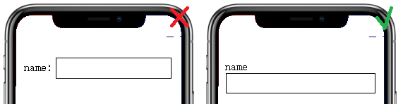
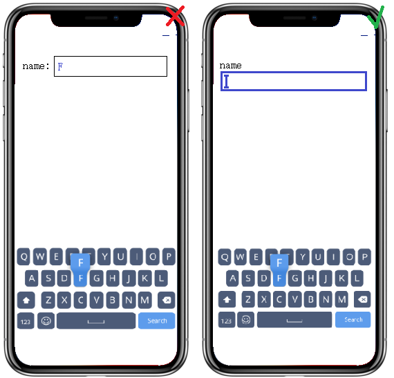
- When it comes to data forms, position the form fields below their labels
- User should be available to control app content size. OS-level features to handle it include setting defaut text size (in Display Settings), or magnifying entire screen/part of the screen under user’s fingers (available in Accessibility Settings)
- Success Criterion 1.4.4 Resize Text (Level AA): Except for captions and images of text, text can be resized without assistive technology up to 200 percent without loss of content or functionality.
- It should be kept in mind that mobile phones can be used in different outdoor conditions and the readability of screen content may vary.
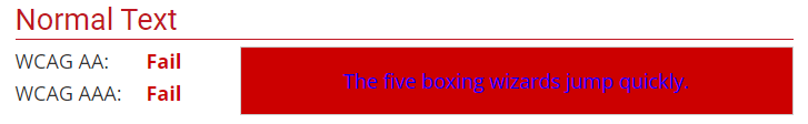
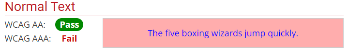
- Success Criterion 1.4.3 Contrast (Minimum) (Level AA): The visual presentation of text and images of text has a contrast ratio of at least 4.5:1. In practice, it means that the difference in color between text and its background should be big enough for the text to be accessible for by people with moderately low vision (who do not use contrast-enhancing assistive technology).
Contrast of 1.45:1 :
 Contrast of 4.84:1 :
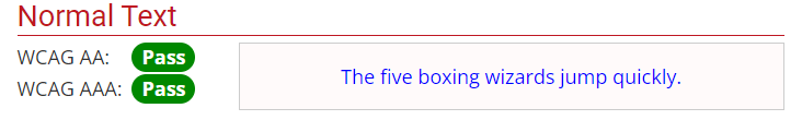
- Success Criterion 1.4.6 Contrast (Enhanced) (Level AAA): The visual presentation of text and images of text has a contrast ratio of at least 7:1
Contrast of 8.3:1 :
Operability
- The advantage of mobile phones is that the keyboard, not being physical, is only visible when focused on some input. It is important to make it as accessible as possible, including a support for an external physical keyboard or alternative input ways.
- People with visual disabilities can benefit from some characteristics of physical keyboards over touchscreen keyboards
- People with physical disabilities, can benefit from keyboards optimized to minimize inadvertent presses
- Some people can be confused by the dynamic nature of the digital keyboard and may prefer the physical one.
- Success Criterion 2.1.1 Keyboard (Level A): All functionality of the content is operable through a keyboard interface without requiring specific timings for individual keystrokes, except where the underlying function requires input that depends on the path of the user’s movement and not just the endpoints. This means the keyboard interface is being used and the usage of alternate keyboard is possible. E.g. a blind person is not able to use the mouse input, or any other one that requires mouse-hand coordination.
- Success Criterion 2.1.2 No Keyboard Trap (Level A): If keyboard focus can be moved to a component of the page using a keyboard interface, then focus can be moved away from that component using only a keyboard interface, and, if it requires more than unmodified arrow or tab keys or other standard exit methods, the user is advised of the method for moving focus away. E.g. user can move through the calendar tabbing through its content.
- Success Criterion 2.4.3 Focus Order (Level A): If a Web page can be navigated sequentially and the navigation sequences affect meaning or operation, focusable components receive focus in an order that preserves meaning and operability. This means order of the sequential information should be consistent with with focus order.
-
Success Criterion 2.4.7 Focus Visible (Level AA): Any keyboard operable user interface has a mode of operation where the keyboard focus indicator is visible. The app developer should help the user know which element has the keyboard focus. ‘
-
Interactive elements on the screen should be big enough and spaced widely enough not to be tapped by accident when wanting to perform other action. Best practices recommend ensuring that touch targets are at least 9 mm high by 9 mm wide (which is around 48x48dp) and surrounded by a small amount of inactive space.
- In the age of multiple screen gestures, it important to make them as simple as possible. For people with some disabilities who e.g. use a stylus, some gestures might be hard to perform. Another thing is that some instructions on how to use provided gestures can be useful.
- Be careful of device manipulation gestures - when shaking or tilting the phone may not be a hard action to perform, it can be a challenge for users with disabilities.
- Buttons should be easily accessible, e.g. with a move of thumb, no matter left or right hand.
Understandability
- Some users have their devices fixed in a particular position, e.g. when mounted to a wheelchair. Developers should try to support both portrait and landscape orientation of an app. Moreover, changes in orientation should be signalled if the user is utilizing the screen reader.
- Consistency of layout is essential. If an element is repeated throughout a screens, its position should be fixed and the same on all of them. Order of reappearing elements should also be equal.
- Success Criterion 3.2.3 Consistent Navigation (Level AA): Navigational mechanisms that are repeated on multiple Web pages within a set of Web pages occur in the same relative order each time they are repeated, unless a change is initiated by the user. E.g. Iindividuals with low vision who use screen magnification to display a small portion of the screen at a time often use visual cues and page boundaries to quickly locate repeated content.
- Success Criterion 3.2.4 Consistent Identification (Level AA): Components that have the same functionality within a set of Web pages are identified consistently. People who use screen readers use when operating a rely heavily on their familiarity with functions that may appear on different Web pages. If identical functions have different labels (or, more generally, a different accessible name) on different Web pages, the site will be considerably more difficult to use.
- Most important piece of information should be visible without scrolling
- Elements that perform the same actions should not be duplicated.
- Success Criterion 2.4.4 Link Purpose (In Context) (Level A): The purpose of each link can be determined from the link text alone or from the link text together with its programmatically determined link context, except where the purpose of the link would be ambiguous to users in general.
- Success Criterion 2.4.9 Link Purpose (Link Only) (Level AAA): A mechanism is available to allow the purpose of each link to be identified from link text alone, except where the purpose of the link would be ambiguous to users in general.
- Elements that trigger changes should be easily distinguishable from non-actionable elements. They should also be recognizable by screen readers. Examples of distinguishing features include providing a conventional shape, style or positioning, color offset and widely known iconography.
- Success Criterion 3.3.2 Labels or Instructions (Level A): Labels or instructions are provided when content requires user input. It helps to ensure the user will understand how to access the input and what to in there.
- Success Criterion 3.3.5 Help (Level AAA): Context-sensitive help is available. Users with disabilities may be more likely to make mistakes than users without disabilities. Using context-sensitive help, users find out how to perform an operation without losing track of what they are doing.
Robustness
- Setting the type of keyboard helps prevent errors and ensures formats are correct. However, it can be confusing for people who are using a screen reader when there are subtle changes in the keyboard.
- The need for text entry should be reduced. Provide select menus, radio buttons, check boxes or by automatically entering known information (e.g. date, time, location).
- Support the platform characteristic features defined in accessibility settings.
Accessibility in practice
- Accessibility settings - Main place for all accessibility features available on both Android and iOS. It allows for control of visual, auditory and motor aids on the device.
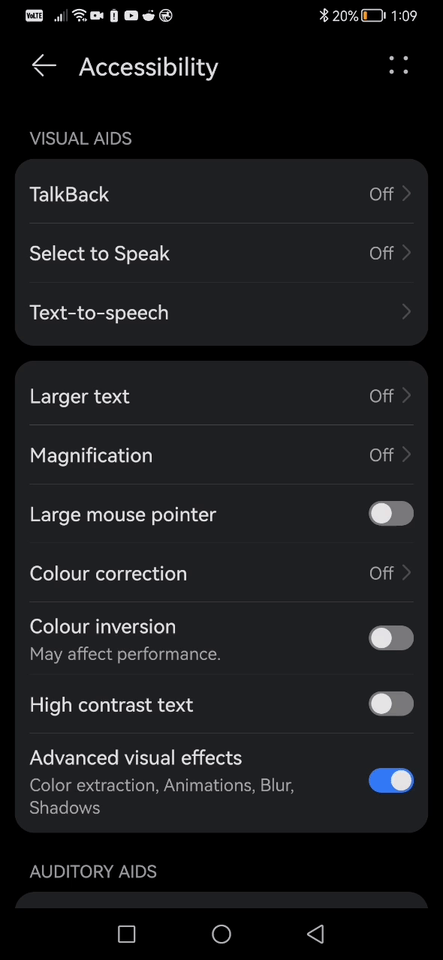
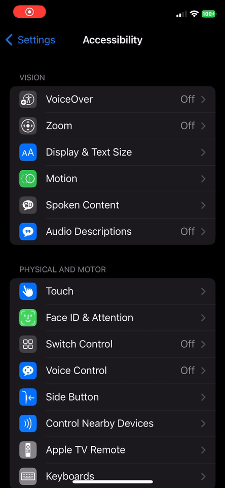
As it has been mentioned by W3C, the text size and contrast remain a very important criterium when developing an accessible app. From the accessibility settings, user can select larger text size, enhance the contrast or even choose a color-corrected display for partial color blindness. However, it only affects the visible colors, not the real colors and the change is not visible on a screenshot.
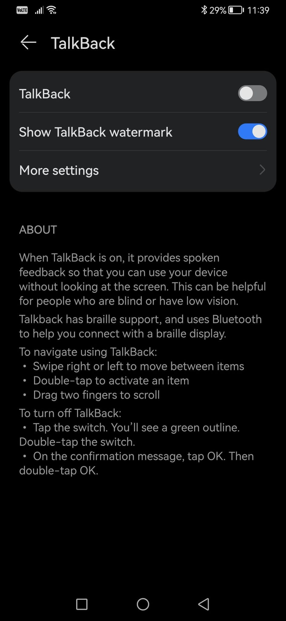
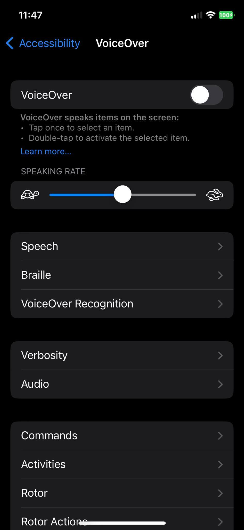
- Screen reader - One of the most important features for people with impaired vision. It reads the content of the screen to the user and is available from the phone’s accessibility settings, no need for downloading an app. It goes under a name TalkBack on Android and VoiceOver on iOS.
TalkBack/VoiceOver proves the importance of good input fields labelling, decreasing the amount of information on one screen and intuitive layout. With such proper sign, the operation of screen reader is more simplified. The screen reader settings also allow the user to configure a Braille keyboard. But what does it look like, if the widely known Braille focuses on touch? Well, the Braille keyboard on mobile takes entire screen and shows six dots which, with some help of the screen reader allow for the input.
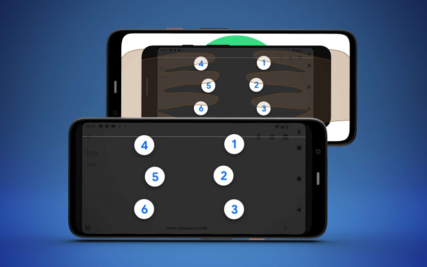
Here is a video on how the TalkBack screen reader is used as well as the Braille input.
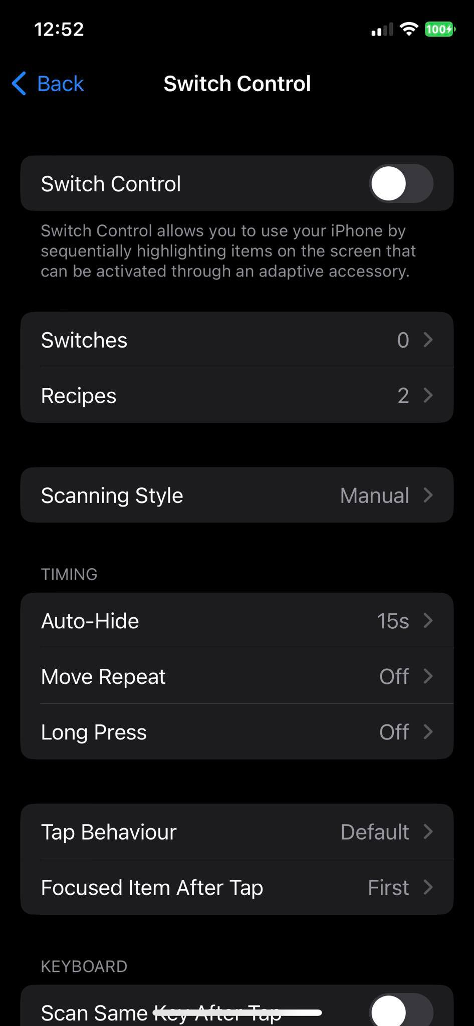
- Switch access - It allows for the device to be controlled by a physical switch. Provides a way of input and phone handling for people with motion impairement. Available natively on both Android and iOS under the accessibility settings.
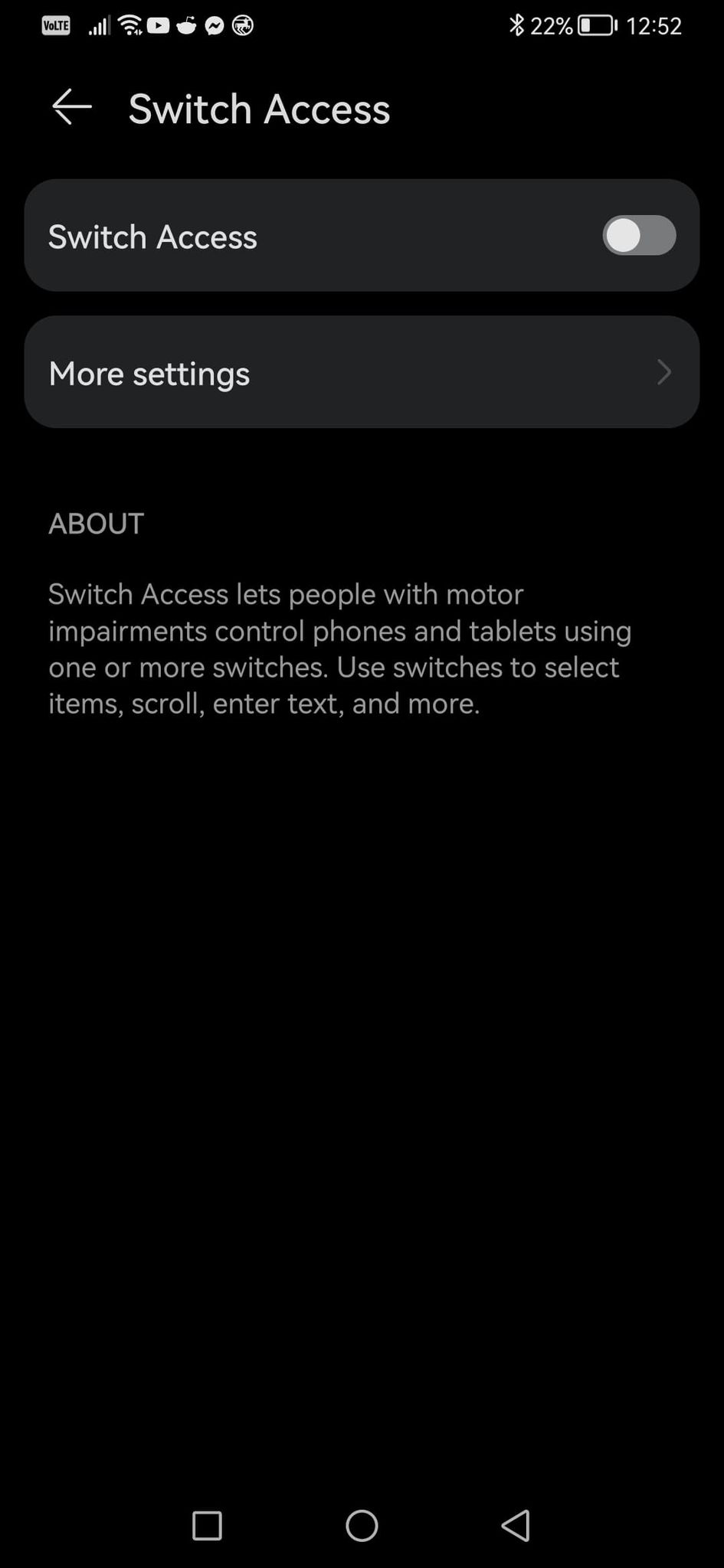
This feature exploits the understandability criterium, recommend by W3C. Switch access might be used by people with serious enough mobility issues to be put on a wheelchair, where the phone would be in a fixed position and orientation. Moreover, if the app layout repeats on a few screens, a person using a switch will be able to move around the app much faster. Below is an official Google video showing a short explanation of switch access feature. For more tutorials visit Google support page.
Flutter and “encoded” accessibility
Another important concept is whether it is possible to somehow encode a desire for accessibility in an app. When the user interface of an app is divided into template and layout overlays, first of them containing widgets arrangement while the other one the widgets themselves with their args, the question is, is it achievable to impose on them both third, accessibility overlay? Let us present a few possible solutions considering flutter as a app programming language.
- Acessibility overlay idea #1 - For some requirements it would be possible to inject them into the widget tree combining not two but THREE overlays. Considering using json_dynamic_widget as a widget tree builder and some own code for merging two JSONs into package-readable one, the third JSON aka accessibility overlay would have to be injected into layout overlay JSON. Let us consider some particular requirements:
-
Label positioning - This one is possible to impose, with some constraints. What is not known from the TextFormField widget and its arguments itself is whether the developer has put the field in a column/row with a text description, fake label. Below is an example of a JSON describing a text_form_field.
1
2
3
4
5
6
7
8
9
10
{
  "type": "text_form_field",
  "id": "first_name",
  "args": {
    "decoration": {
      "hintText": "John",
      "labelText": "First Name",
    },
  }
}
If a developer has put a
hintTextthere, but nolabelText, code that merges the overlays could puthintTextvalue for alabelText. Not a perfect solution, since label should be a definite word describing input, while hint should be providing an example for an input, but when a hintText saysYour name, e.g. John, such label text would be enough to understand. If a developer has put a fake label above a TextFormField, that would be more difficult, but the merger could check for a widget “next to” the TextFormField. ONLY if they remain in the same row/column. But what if they do not? - keyboard type - robustness criterium to provide e.g. numeric keyboard when a PIN input is wanted. Again, having in mind a Flutter
TextFormFieldwidget, it can define a keyboard type usingkeyboardTypeattribute:1 2 3 4 5
"type": "text_form_field", "id": "first_name", "args": { "keyboardType": "phone" }
Easy to inject as well. Merging code could easily impose a
keyboardTypearg if it has not been provided. BUT what kind of keyboard type? Accessibility recommendation is that a specific input is provided for some fields like phone number. No doubts about that, for people using switch access it would be much faster to switch through 9 numbers that wait for the right number on the qwerty keyboard to show. The proposal is to provide it. However, the input type depends on the form data themselves. It is not possible to do something like this for accessibility overlay:1 2 3 4 5 6 7 8
"accessibility":[ { "type": "text_form_field", "args":{ "keyboardType": true } } ]
This way, what can be achieved is a necessity to provide a keyboard type. But the type itself would have to be read e.g. from a label - if it says ‘phone’, go for
"keyboardType" : "phone". ‘email address’?"keyboardType" : "emailAddress". But what if the label says something completely different, like PESEL evidential number? Merging code would have to be programmed to read this as a numeric input. Moreover, it is not possible to just copy the label as a keyboard type. Email being a great example for this one. - Link purpose - Is it even possible to define this one? The AAA criterium says that every link text should define link purpose. Considering such a situation - the developer is making an app about birds. Each screen is a name, photo and short description of a bird. App is accessible, contrast is 8.5:1, font is large. At the bottom of each screen there is a smaller
Source of informationtext, which serves as a link to a Wikipedia page about each bird. And this is perfectly fine, screen reader would read this as “Source of information. Double tap to activate” or something similar, the user would know how to follow it. But is it achievable to enforce a understandable link text? Let us start with the fact that it is UNKNOWN whether a text is a link - Flutter has no link widget, and a simple way to provide a link text would look like this (url_launcherpackage required):1 2 3 4
InkWell( child: Text('Open Browser'), onTap: () => launch('https://docs.flutter.io/flutter/services/UrlLauncher-class.html') ),
It is not desirable to impose something on each
InkWellwidget as none of them have to be links. But hypothetically, considering there exists a link widget, how can it be forced to say “Source of information” instead of e.g. “x”? Only when it is known that the screen is responsible of information about birds and if a link occurs, it is a source of information on Wikipedia. Such hypothetical accessibility overlay could look like this:1 2 3 4 5 6 7 8
"accessibility":[ { "type": "link_widget", "args":{ "text": "Source of information" } } ]
- Focus visible - a criterium that actually could be imposed by an accessibility layout. Not in the best possible way, hovever. This one mentions that a focused field (let us talk about a
TextFormFieldagain…) should be easily distinguished from a non-focused one. Luckily,TextFormField’sInputDecorationhas a field calledfocusedBorder, which defines a border, that is shown when the field is focused. Accessiblity overlay could force that a border width, when the field is not fucused would be 1 and when focused, 3. It would enable the user to distinguish between the states of the text field:1 2 3 4 5 6 7 8 9 10 11 12 13 14 15 16 17 18 19 20 21 22 23 24 25
"accessibility":[ { "type": "text_form_field", "args": { "decoration": { "focusedBorder": { "type": "outline", "args":{ "borderSide":{ "width" : 3 } } }, "border": { "type": "outline", "args":{ "borderSide":{ "width" : 1 } } } } } } ]
This way color of none of the borders would be defined, but the difference between focused and unfocused state would be imposed.
- Interactive elements size - Luckily, when it comes to buttons (but buttons only!) Flutter provides a way to define their size. Each of the button classes (
ElevatedButton,OutlinedButton,TextButton) has an attribute calledminimumSize:1 2 3 4 5 6 7
ElevatedButton( onPressed: onPressed, child: const Text('x'), style: ElevatedButton.styleFrom( minimumSize: Size(48, 48), ), ),
This way, an accessibility overlay can enforce a minimum size of a button:
1
2
3
4
5
6
7
8
9
10
"accessibility":[
    {
        "type": "elevated_button",
        "args": {
          "style": {
            "minimumSize" : [48,48]
          }
        }
    }
]
However it is crucial to keep in mind that buttons are not the only elements that are interactive.
-
Accessibility overlay would for sure be a step forward, but there are situations where automatic imposing of some accessibility recommendations would not be possible and human verification would be crucial.
- Overlay parser - Not a overlay itself, this last chance solution would be checking whether the designed layout meets accessibility requirements, not imposing them. This should be treated as a “fun fact” and a workaround, not a definite solution.
- Color contrast - What is necessary to find the contrast between two colored items is the tint of both child and parent widget, for entire widget. While not impossible, it would impose a requirement of iterating through all widgets and developing some contrast checking code.
1
2
3
4
5
6
7
8
9
10
for(widget in widgetTree){
    var contrast = checkContrast(widget.parent, widget)
    if(contrast> 7:1){
        //App very accessible
    }else if(contrast> 4.5:1){
        //App accessible
    }else{
        //App not accessible
    }
}
- Label positioning - Label of a TextFormField should be positioned above the field, not next to it. Actually, there is no need of an artificial label at all. TextFormField has a field called
decorationwhich can contain the label itself:1 2 3 4 5 6 7
TextFormField( decoration: const InputDecoration( icon: Icon(Icons.person), hintText: 'What do people call you?', labelText: 'Name', ), )
So it would be necessary to just check whether all the widget tree elements that are of type TextFormField contain labelText.
1
2
3
4
5
6
7
8
9
for(widget in widgetTree){
    if(widget.isTextFormField){
        if(widget.containsLabelText){
            //App accessible
        }else{
            App not accessible
        }
    }
}
And the list can go on and on. Let us stop with these 2 examples as this idea is just a workaround, not a real solution.
- Color contrast - What is necessary to find the contrast between two colored items is the tint of both child and parent widget, for entire widget. While not impossible, it would impose a requirement of iterating through all widgets and developing some contrast checking code.
Accessibility overlay proposal
Summing up the points about encoded accessibility and W3C guide, the JSON shown in this part of the article could serve as an accessibility overlay. It is important to keep in mind that many of the requirements proposed by W3C cannot be machine-imposed. A lot of them require some context to be understood, like link text or keyboard type.
1
2
3
4
5
6
7
8
9
10
11
12
13
14
15
16
17
18
19
20
21
22
23
24
25
26
27
28
29
30
31
32
33
"accessibility":[
    {
        "type": "elevated_button",
        "args": {
          "style": {
             "minimumSize" : [48,48]
          }
        }
    },
    {
        "type": "text_form_field",
        "args": {
          "decoration": {
                "focusedBorder": {
                    "type": "outline",
                    "args":{
                        "borderSide":{
                            "width" : 3
                        }
                    }
                },
                "border": {
                    "type": "outline",
                    "args":{
                        "borderSide":{
                            "width" : 1
                        }
                    }
                }
            }
        }
    }
]
Summary
Accessibility overlay could serve an important purpose for both disabled people and app developers. Without further research, app creators would be able to adjust their content to some special needs. No matter how easy this sounds, the real task is actually much more difficult. First of all, the list created by W3C is just a requirement guide. Actual people with disabilities may have other, individual wishes, that are not on the list. Such briefs or proposed here solutions are made by people who do not use them. It would be advised to consult accessibility solutions with people who would be their users, who need the app adjusted to their needs. Moreover, as stated before, some of the solutions for accessibility overlay require context of the field. Keyboard type or link text has to be imposed basing on their surroundings, which may be hard or even impossible to get by a machine. Another important thing is the operating system of a device. Actually it is absolutely stunning that both mobile ecosystems have so many native solutions for accessibility, that allow numerous disabled people to use their products with greater comfort (or even be able to use them at all). However, for desktops, the accessibility features may look completely different. Overlays should be able to distinct between mobile and stationary device, which requires at least two accessibility overlays for one app. To sum up, it would be both beneficial and really hard to create a solution that would successfully impose amenities for the disabled on the app creation.